Performance and data visualization examples
A variety of visualization functions are integrated in EnrichRBP, which can perform certain correlation analysis on feature data and also visualize the obtained performance index data for plotting.
Performance metrics visualization
In this section, we give examples of performance metrics visualization functions in EnrichRBP, please note that when using these functions, you need to install yellowbrick, seaborn and scikit-learn
Data preparation
Here we prepare the relevant features as well as models to be used in different plot functions.
fasta_path = '/home/wangyansong/wangyubo/EnrichRBP/src/RNA_datasets/circRNAdataset/AGO1/seq'
label_path = '/home/wangyansong/wangyubo/EnrichRBP/src/RNA_datasets/circRNAdataset/AGO1/label'

sequences = read_fasta_file(fasta_path)  # read sequences and labels from given path
label = read_label(label_path)

# Generate dynamic semantic information for training deep learning models
dynamic_semantic_information = generateDynamicLMFeatures(sequences, kmer=4, model='/home/wangyansong/wangyubo/EnrichRBP/src/dynamicRNALM/circleRNA/pytorch_model_4mer')

# Generate biological features for training machine learning classifiers
biological_features = generateBPFeatures(sequences, PGKM=True)

# create CNN and RNN models for plots.
CNN_model = createCNN(dynamic_semantic_information.shape[1], dynamic_semantic_information.shape[2])
RNN_model = createRNN(dynamic_semantic_information.shape[1], dynamic_semantic_information.shape[2])

# create several machine learning classifiers for plots.
ML_Classifiers = [
    LogisticRegression(max_iter=10000),
    KNeighborsClassifier(),
    DecisionTreeClassifier(),
    GaussianNB(),
    SVC(probability=True)
]
# We use as an example the performance data obtained in the previous evaluation of machine learning classifiers
ml_metric_data = pd.read_csv('/home/wangyansong/wangyubo/EnrichRBP/src/ML_evalution_metrics.csv')

callbacks = [EarlyStopping(monitor='val_loss', patience=5, verbose=2, mode='min', restore_best_weights=True)]
labels_2D = to_categorical(label)
The format of the metric file is as follows:
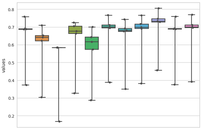
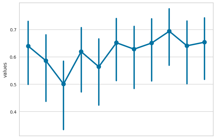
                      clf_name    values metric_name
0           LogisticRegression  0.757671         AUC
1           LogisticRegression  0.686194         ACC
2           LogisticRegression  0.372397         MCC
3           LogisticRegression  0.690023      Recall
4           LogisticRegression  0.687357   F1_Scores
5         KNeighborsClassifier  0.708609         AUC
6         KNeighborsClassifier  0.651634         ACC
7         KNeighborsClassifier  0.303814         MCC
8         KNeighborsClassifier  0.622109      Recall
9         KNeighborsClassifier  0.641023   F1_Scores
10      DecisionTreeClassifier  0.583520         AUC
11      DecisionTreeClassifier  0.583583         ACC
12      DecisionTreeClassifier  0.167029         MCC
13      DecisionTreeClassifier  0.583673      Recall
14      DecisionTreeClassifier  0.583596   F1_Scores
15                  GaussianNB  0.724388         AUC
16                  GaussianNB  0.662461         ACC
17                  GaussianNB  0.326168         MCC
18                  GaussianNB  0.703995      Recall
19                  GaussianNB  0.675895   F1_Scores
20           BaggingClassifier  0.699751         AUC
21           BaggingClassifier  0.642049         ACC
22           BaggingClassifier  0.286901         MCC
23           BaggingClassifier  0.573204      Recall
24           BaggingClassifier  0.615563   F1_Scores
25      RandomForestClassifier  0.766152         AUC
26      RandomForestClassifier  0.693585         ACC
27      RandomForestClassifier  0.387366         MCC
28      RandomForestClassifier  0.710193      Recall
29      RandomForestClassifier  0.698591   F1_Scores
30          AdaBoostClassifier  0.742326         AUC
31          AdaBoostClassifier  0.675107         ACC
32          AdaBoostClassifier  0.350416         MCC
33          AdaBoostClassifier  0.690847      Recall
34          AdaBoostClassifier  0.680126   F1_Scores
35  GradientBoostingClassifier  0.764653         AUC
36  GradientBoostingClassifier  0.690264         ACC
37  GradientBoostingClassifier  0.381289         MCC
38  GradientBoostingClassifier  0.716291      Recall
39  GradientBoostingClassifier  0.698100   F1_Scores
40                         SVM  0.804761         AUC
41                         SVM  0.727653         ACC
42                         SVM  0.455588         MCC
43                         SVM  0.745526      Recall
44                         SVM  0.732425   F1_Scores
45  LinearDiscriminantAnalysis  0.758004         AUC
46  LinearDiscriminantAnalysis  0.687464         ACC
47  LinearDiscriminantAnalysis  0.375057         MCC
48  LinearDiscriminantAnalysis  0.691123      Recall
49  LinearDiscriminantAnalysis  0.688563   F1_Scores
50        ExtraTreesClassifier  0.768708         AUC
51        ExtraTreesClassifier  0.695433         ACC
52        ExtraTreesClassifier  0.391130         MCC
53        ExtraTreesClassifier  0.710470      Recall
54        ExtraTreesClassifier  0.699929   F1_Scores
violin plot
This example shows how to use the EnrichRBP.metricsPlot module to plot violin figure.
# The x-axis is divided according to clf_name, and the various performance metrics are put together on the y-axis to draw a violin plot
violinplot(ml_metric_data, x_id='clf_name', y_id='values', image_path='./')
After the function finishes running, it will save a violinplot.png file in the path specified by image_path, as follows:

box plot
This example shows how to use the EnrichRBP.metricsPlot module to plot box figure.
# The x-axis is divided according to clf_name, and the various performance metrics are put together on the y-axis to draw a box plot
boxplot(ml_metric_data, x_id='clf_name', y_id='values', image_path='./')
After the function finishes running, it will save a boxplot.png file in the path specified by image_path, as follows:
point plot
This example shows how to use the EnrichRBP.metricsPlot module to plot point figure.
# The x-axis is divided according to clf_name, and the various performance metrics are put together on the y-axis to draw a point plot
pointplot(ml_metric_data, x_id='clf_name', y_id='values', image_path='./')
After the function finishes running, it will save a pointplot.png file in the path specified by image_path, as follows:
bar plot
This example shows how to use the EnrichRBP.metricsPlot module to plot bar figure.
# The x-axis is divided according to clf_name, and the various performance metrics are put together on the y-axis to draw a box plot
barplot(ml_metric_data, x_id='clf_name', y_id='values', image_path='./')
After the function finishes running, it will save a barplot.png file in the path specified by image_path, as follows:

Plot roc curve
This example shows how to use the EnrichRBP.metricsPlot module to plot the roc curve.
Deep learning models
label_list = []
pred_proba_list = []
name_list = ['CNN', 'RNN']

# Divide the features into training and test sets in the ratio of 3:1
X_train, test_X, y_train, test_y = train_test_split(dynamic_semantic_information, labels_2D, test_size=0.25, random_state=6)

# Take 10% from the training set as the validation set
train_X, val_X, train_y, val_y = train_test_split(X_train, y_train, test_size=0.1, random_state=6)

# train CNN and RNN models
CNN_model.compile(optimizer='adam', loss='binary_crossentropy', metrics=['accuracy'])
CNN_model.fit(x=train_X, y=train_y, epochs=30, batch_size=64, verbose=0, shuffle=True, callbacks=callbacks,
                      validation_data=(val_X, val_y))
pre_proba_CNN = CNN_model.predict(test_X)[:, 1]
test_y1 = test_y[:, 1]
label_list.append(test_y1)
pred_proba_list.append(pre_proba_CNN)

RNN_model.compile(optimizer='adam', loss='binary_crossentropy', metrics=['accuracy'])
RNN_model.fit(x=train_X, y=train_y, epochs=30, batch_size=64, verbose=0, shuffle=True, callbacks=callbacks,
                      validation_data=(val_X, val_y))
pre_proba_RNN = RNN_model.predict(test_X)[:, 1]
test_y2 = test_y[:, 1]
label_list.append(test_y2)
pred_proba_list.append(pre_proba_RNN)

# plot the roc curve
roc_curve_deeplearning(label_list=label_list, pred_proba_list=pred_proba_list, name_list=name_list, image_path='./')
After the function finishes running, it will save a roc_curve.png file in the path specified by image_path, as follows:

Machine learning classifiers
In the machine learning plotting process, we don’t need to train the classifiers manually, we just need to pass the feature matrix, labels and classifiers into the function.
# Using the previously created set of classifiers and the biological feature matrix, the test set ratio is set to 0.25 for roc curve plotting.
roc_curve_machinelearning(biological_features, label, ML_Classifiers, image_path='./', test_size=0.25, random_state=6)
After the function finishes running, it will save a roc_curve.png file in the path specified by image_path, as follows:

Plot confusion matrix
This example shows how to use the EnrichRBP.metricsPlot module to plot the confusion matrix.
Deep learning models
# Divide the features into training and test sets in the ratio of 3:1
X_train, test_X, y_train, test_y = train_test_split(dynamic_semantic_information, label, test_size=0.25, random_state=6)

# Take 10% from the training set as the validation set
train_X, val_X, train_y, val_y = train_test_split(X_train, y_train, test_size=0.1, random_state=6)

# train CNN model for example
CNN_model.compile(optimizer='adam', loss='binary_crossentropy', metrics=['accuracy'])
CNN_model.fit(x=train_X, y=train_y, epochs=30, batch_size=64, verbose=0, shuffle=True, callbacks=callbacks,
                      validation_data=(val_X, val_y))
pre_proba_CNN = CNN_model.predict(test_X)
pred_labels = np.argmax(pre_proba_CNN, axis=1)
test_labels = test_y[:, 1]

# plot the confusion matrix
confusion_matirx_deeplearning(test_labels=test_labels, pred_labels=pred_labels, image_path='./')
After the function finishes running, it will save a confusion_matrix.png file in the path specified by image_path, as follows:

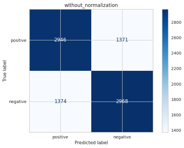
Machine learning classifiers
# select the LogisticRegression for example
clf = ML_Classifiers[0]

# the test set ratio is set to 0.25 for plotting confusion matrix
confusion_matrix_machinelearning(clf, biological_features, label, test_size=0.25, normalize=None, random_state=6, image_path='./')
After the function finishes running, it will save a without_normalization_confusionMatrix.png file in the path specified by image_path, as follows:
When normalize is set to ‘true’, ‘pred’ or ‘all’, the resulting image is as follows (file name is normalization_confusionMatrix.png):

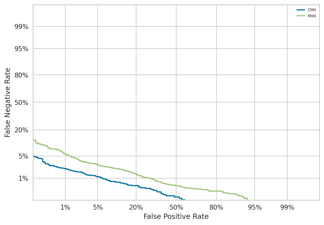
Plot det curve
This example shows how to use the EnrichRBP.metricsPlot module to plot the det curve.
Deep learning models
label_list = []
pred_proba_list = []
name_list = ['CNN', 'RNN']

# Divide the features into training and test sets in the ratio of 3:1
X_train, test_X, y_train, test_y = train_test_split(dynamic_semantic_information, labels_2D, test_size=0.25, random_state=6)

# Take 10% from the training set as the validation set
train_X, val_X, train_y, val_y = train_test_split(X_train, y_train, test_size=0.1, random_state=6)

# train CNN and RNN models
CNN_model.compile(optimizer='adam', loss='binary_crossentropy', metrics=['accuracy'])
CNN_model.fit(x=train_X, y=train_y, epochs=30, batch_size=64, verbose=0, shuffle=True, callbacks=callbacks,
                      validation_data=(val_X, val_y))
pre_proba_CNN = CNN_model.predict(test_X)[:, 1]
test_y1 = test_y[:, 1]
label_list.append(test_y1)
pred_proba_list.append(pre_proba_CNN)

RNN_model.compile(optimizer='adam', loss='binary_crossentropy', metrics=['accuracy'])
RNN_model.fit(x=train_X, y=train_y, epochs=30, batch_size=64, verbose=0, shuffle=True, callbacks=callbacks,
                      validation_data=(val_X, val_y))
pre_proba_RNN = RNN_model.predict(test_X)[:, 1]
test_y2 = test_y[:, 1]
label_list.append(test_y2)
pred_proba_list.append(pre_proba_RNN)

# plot the det curve
det_curve_deeplearning(label_list, pred_proba_list, name_list, image_path='./')
After the function finishes running, it will save a det_curve.png file in the path specified by image_path, as follows:
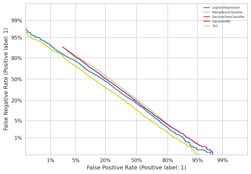
Machine learning classifiers
In the machine learning plotting process, we don’t need to train the classifiers manually, we just need to pass the feature matrix, labels and classifiers into the function.
det_curve_machinelearning(biological_features, label, ML_Classifiers, image_path='./', test_size=0.25, random_state=6)
After the function finishes running, it will save a det_curve.png file in the path specified by image_path, as follows:
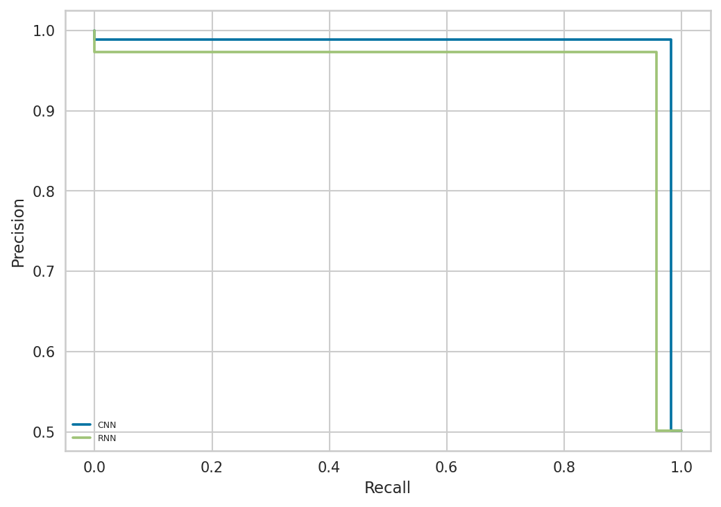
Plot precision recall curve
This example shows how to use the EnrichRBP.metricsPlot module to plot the precision recall curve.
Deep learning models
label_list = []
pred_label_list = []
name_list = ['CNN', 'RNN']

# Divide the features into training and test sets in the ratio of 3:1
X_train, test_X, y_train, test_y = train_test_split(dynamic_semantic_information, labels_2D, test_size=0.25, random_state=6)

# Take 10% from the training set as the validation set
train_X, val_X, train_y, val_y = train_test_split(X_train, y_train, test_size=0.1, random_state=6)

# train CNN and RNN models
CNN_model.compile(optimizer='adam', loss='binary_crossentropy', metrics=['accuracy'])
CNN_model.fit(x=train_X, y=train_y, epochs=30, batch_size=64, verbose=0, shuffle=True, callbacks=callbacks,
                      validation_data=(val_X, val_y))
pre_proba_CNN = CNN_model.predict(test_X)
test_y1 = test_y[:, 1]
label_list.append(test_y1)
pred_label_list.append(np.argmax(pre_proba_CNN, axis=1))

RNN_model.compile(optimizer='adam', loss='binary_crossentropy', metrics=['accuracy'])
RNN_model.fit(x=train_X, y=train_y, epochs=30, batch_size=64, verbose=0, shuffle=True, callbacks=callbacks,
                      validation_data=(val_X, val_y))
pre_proba_RNN = RNN_model.predict(test_X)
test_y2 = test_y[:, 1]
label_list.append(test_y2)
pred_label_list.append(np.argmax(pre_proba_RNN, axis=1))

# plot the precision recall curve
precision_recall_curve_deeplearning(label_list, pred_label_list, name_list, image_path='./')
After the function finishes running, it will save a precision_recall_curve.png file in the path specified by image_path, as follows:
Machine learning models
precision_recall_curve_machinelearning(biological_features, label, ML_Classifiers, image_path='./', test_size=0.25, random_state=6)
After the function finishes running, it will save a precision_recall_curve.png file in the path specified by image_path, as follows:

Plot partial dependence
This example shows how to use the EnrichRBP.metricsPlot module to plot the partial dependence.
clf = ML_Classifiers[0]

# Plot the first six dimensions of features, and if you use a dataframe, you can specify specific feature names
partial_dependence(biological_features, label, clf, feature_names=[0, 1, 2, 3, 4, 5], image_path='./', random_state=6)
After the function finishes running, it will save a partial_dependence.png file in the path specified by image_path, as follows:

Note
Currently this function is only available for machine learning classifiers, please look forward to subsequent implementations for deep learning models.
Plot prediction error bar
This example shows how to use the EnrichRBP.metricsPlot module to plot prediction error bar figure.
clf = ML_Classifiers[-1]
prediction_error(biological_features, label, classes=['positive', 'negative'], clf=clf, test_size=0.25, random_state=6, image_path='./')
After the function finishes running, it will save a prediction_error.png file in the path specified by image_path, as follows:

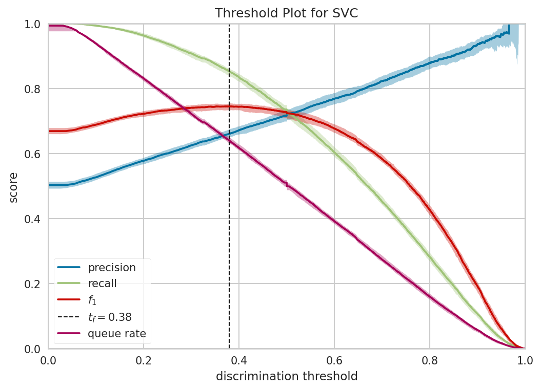
Plot descrimination threshold
This example shows how to use the EnrichRBP.metricsPlot module to plot descrimination threshold figure.
clf = ML_Classifiers[-1]
descrimination_threshold(biological_features, label, clf, image_path='./')
After the function finishes running, it will save a descrimination_threshold.png file in the path specified by image_path, as follows:
Plot learning curve
This example shows how to use the EnrichRBP.metricsPlot module to plot learning curve figure.
clf = ML_Classifiers[-1]
folds = 5
learning_curve(biological_features, label, folds, clf, image_path='./')
After the function finishes running, it will save a learning_curve.png file in the path specified by image_path, as follows:

Plot cross validation score
This example shows how to use the EnrichRBP.metricsPlot module to plot cross validation score figure.
clf = ML_Classifiers[-1]
folds = 5
cross_validation_score(folds=folds, clf=clf, features=biological_features, labels=label, image_path='./')
After the function finishes running, it will save a cv_score.png file in the path specified by image_path, as follows:

Feature analysis plot
The functions in this section currently only support machine learning classifiers, and the implementation of deep learning models is still in progress, so please look forward to subsequent versions.
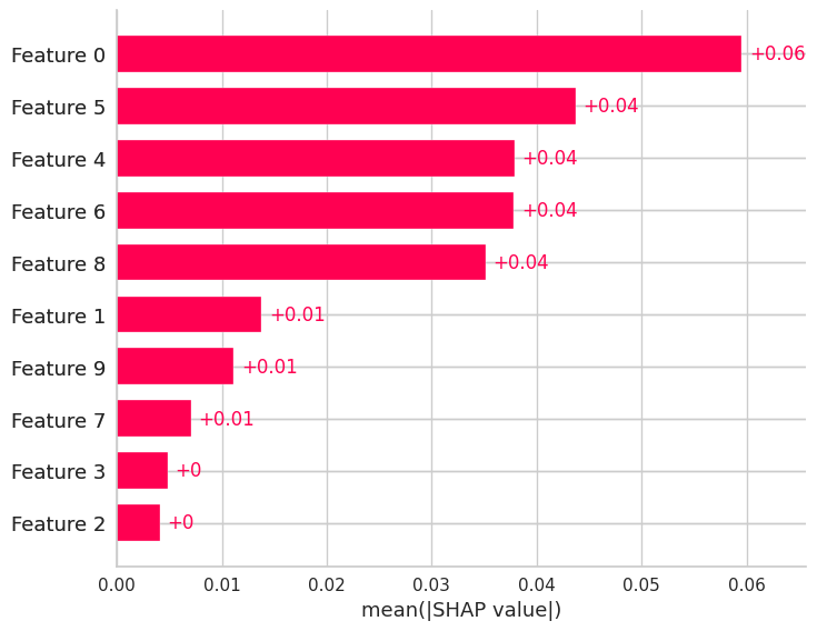
Shap bar plot
This example shows how to use the EnrichRBP.metricsPlot module to plot shap bar figure.
clf = ML_Classifiers[0]

# The shap bar is plotted using logistic regression, where the first 100 samples, and the first 10 dimensional features are selected for the shap value calculation。
shap_bar(biological_features, label, clf, sample_size=(0, 100), feature_size=(0, 10), image_path='./')
After the function finishes running, it will save a shap_bar.png file in the path specified by image_path, as follows:
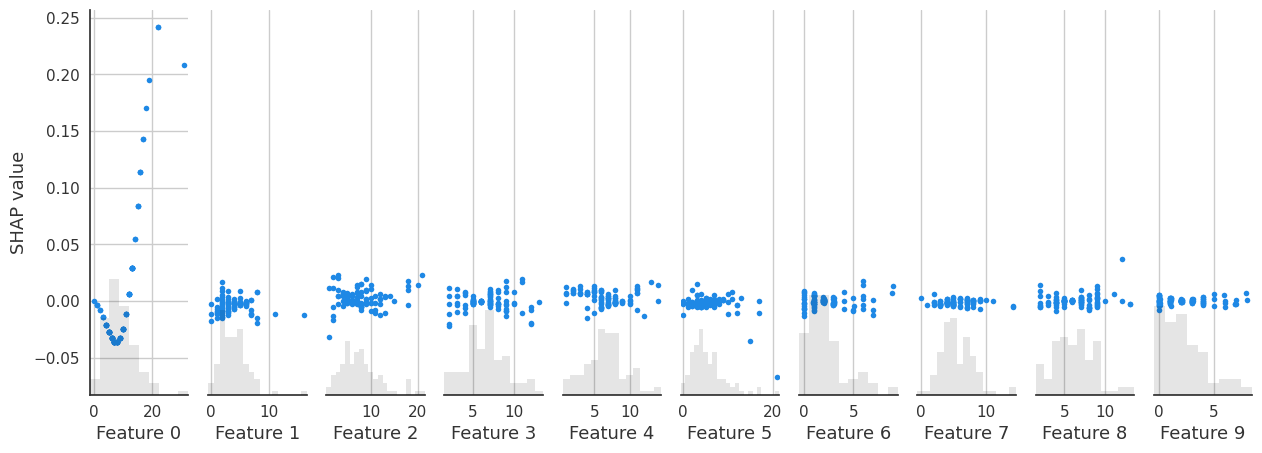
shap scatter plot
This example shows how to use the EnrichRBP.metricsPlot module to plot shap scatter figure.
clf = ML_Classifiers[-1]
shap_scatter(biological_features, label, clf, feature_id=3, sample_size=(0, 100), feature_size=(0, 10), image_path='./')
After the function finishes running, it will save a shap_scatter.png file in the path specified by image_path, as follows:

shap waterfall plot
This example shows how to use the EnrichRBP.metricsPlot module to plot shap waterfall figure.
clf = ML_Classifiers[-1]
shap_waterfall(biological_features, label, clf, feature_id=2, sample_size=(0, 100), feature_size=(0, 10), image_path='./')
After the function finishes running, it will save a shap_waterfall.png file in the path specified by image_path, as follows:

shap interaction scatter plot
This example shows how to use the EnrichRBP.metricsPlot module to plot shap interaction scatter figure.
clf = ML_Classifiers[-1]
shap_interaction_scatter(biological_features, label, clf, sample_size=(0, 100), feature_size=(0, 10), image_path='./')
After the function finishes running, it will save a shap_interaction_scatter.png file in the path specified by image_path, as follows:
shap beeswarm plot
This example shows how to use the EnrichRBP.metricsPlot module to plot shap beeswarm figure.
clf = ML_Classifiers[-1]
shap_beeswarm(biological_features, label, clf, sample_size=(0, 100), feature_size=(0, 10), image_path='./')
After the function finishes running, it will save a shap_beeswarm.png file in the path specified by image_path, as follows:

shap heatmap plot
This example shows how to use the EnrichRBP.metricsPlot module to plot shap heatmap figure.
clf = ML_Classifiers[-1]
shap_heatmap(biological_features, label, clf, sample_size=(0, 100), feature_size=(0, 10), image_path='./')
After the function finishes running, it will save a shap_heatmap.png file in the path specified by image_path, as follows:

Note
The process of ploting the image is very time consuming because the training of shap explainer is required to plot the figure for shap feature analysis, please be patient.
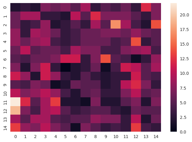
feature heatmap plot
This example shows how to use the EnrichRBP.metricsPlot module to plot feature heatmap figure.
# The x-axis is divided according to clf_name, and the various performance metrics are put together on the y-axis to draw a box plot
sns_heatmap(biological_features, sample_size=(0, 15), feature_size=(0, 15), image_path='./')
After the function finishes running, it will save a sns_heatmap.png file in the path specified by image_path, as follows: